


If you’ve ever looked at your brand’s Instagram feed or website and thought, “Why does this all look kind of… random?” — yeah, I’ve been there too. One post is super bright, the next is dark and moody, and your logo looks different every time you use it.
The truth is, keeping your visuals consistent is harder than people think — especially when you’re a small team (or just you) trying to make everything look polished without going broke. But honestly, it’s doable. You just need a bit of planning and a system for where your photos, videos, and templates live.
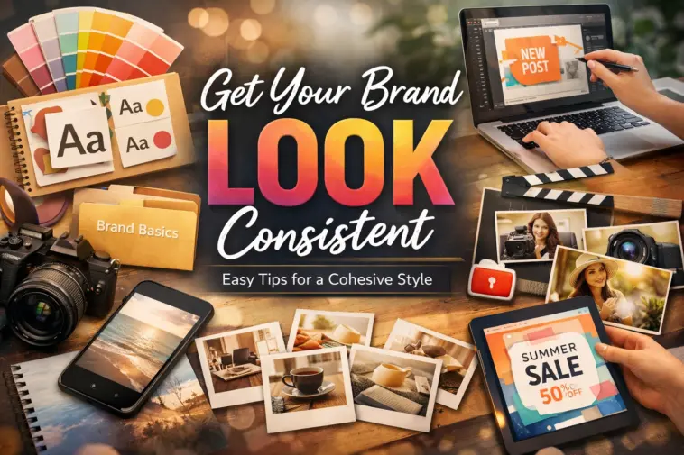
Start by Defining What “Your Look” Actually Is
Before you start saving a hundred random free images, take a step back. Think about what you want your brand to look like. Is it warm and cozy? Clean and modern? Bright and playful?
Pick a few colors and one or two fonts that feel right. You don’t need a full brand book — just a few notes you can stick to. It’ll make everything else a thousand times easier.
I use a folder called “brand basics” with my logo, main colors, and fonts. Nothing fancy, but it keeps me grounded when I start designing stuff.
Stock Photos That Don’t Feel Like Stock Photos
I used to hate stock photos — all those fake smiles and corporate handshakes drove me nuts. But once I found sites with free stock photos and videos like Pikwizard, things got a lot easier. Their stuff feels real — everyday people, simple backgrounds, nice lighting.


When you find a batch that fits your brand vibe, save them together in a folder. Don’t just grab one or two. The trick is to find a set of photos that share the same tone. That way, your posts and designs start to feel connected.
Templates Save You Time (and Headaches)


Image by Pikwizard.com
Templates are your best friend when you’re not a designer. Grab a few that match your general style — for social posts, flyers, presentations, whatever you use most.
Edit them once to match your colors and fonts, and save your versions. Now, whenever you make new content, you can just duplicate and tweak instead of starting from scratch. Pikwizard actually has many nice free templates that are easy to customize if you don’t want to mess with layout stuff.
Add Video, But Keep It Consistent


Image by Pikwizard.com
Video helps your brand look alive — even short clips make a big difference. I’ll usually grab a few simple ones (like product close-ups or short lifestyle shots) and reuse them with different captions or overlays.
You can pull them from Pikwizard too — their stock clips aren’t cheesy, and most of them already look good without heavy editing. Just make sure you use the same type of filters or text styles you use on your photos.
Keep It All in One Place
If there’s one thing that changed how I work, it’s this — I finally made a folder system.
One for photos, one for videos, one for templates. Each with subfolders labeled by mood or theme. It’s not fancy, but now when I need a banner or a post image, I’m not scrolling through chaos.
You don’t need a design degree or an agency to make your brand look consistent. You just need to pick a look, stick with it, and use good free resources.